YOUNG & CO'S BREWERY PLC
It's been our pleasure to provide identity design and marketing support for the pub estate of this great British brand, for the past 5 years.
-
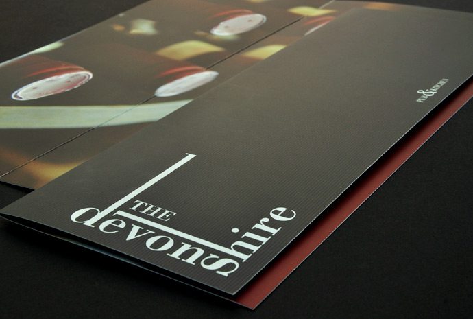
THE DEVONSHIRE
This unassuming little pub in Balham went through a bit of a repositioning in 2009. With a full interior refurbishment, the pub also addressed its food and drink menu. Offering a more premium British menu the pub was keen to attract the diner and business public.
A contemporary twist on traditional values, with a good dose of heritage were the requirements in the pubs visual communication. -
THE SHIP
One of the most popular drinking spots in Southwest London, the Ship is a great little pub. What makes it unique to me are the little things that you don't at first notice. The 40 year old swing sign is an image of a hand grabbing a large ship, in a strangely Monty Python way. The pub has a red phone box unexpectedly placed by its outside barbecue. The food menu changes daily, but sometimes more often... and so it goes on.
I took this as the direction for a series of collages, that also ties in with a "legends and myths of the sea" theme. From posters to receipt holders, these collages can be found on a number of different touchpoints used by the pub.
-
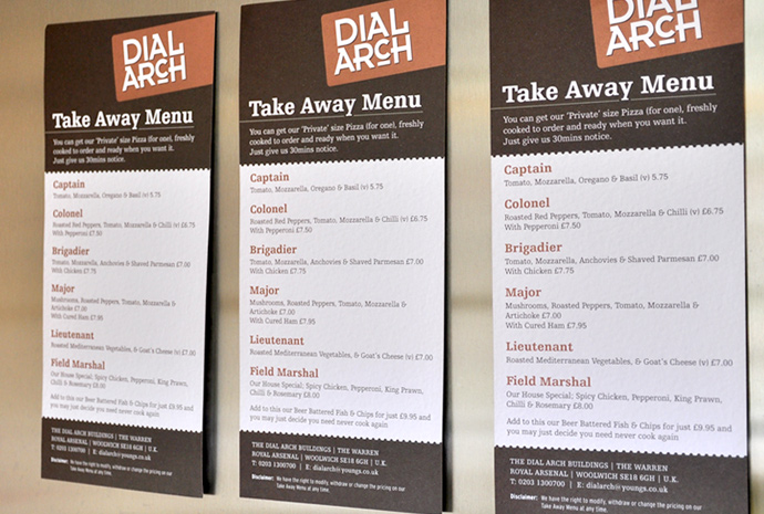
THE DIAL ARCH
This beautiful pub is located within the listed Dial Arch building at the Royal Arsenal Riverside in Woolwich. A location steeped with British 19th and 20th century military history, which informed the interior design, as well as the identity direction.
The logo uses a bold, strong font, and wouldn't be out of place embossed into the steel plating of a piece of ammunition hardware. The metallic copper pantone colour as part of the colour scheme pushes further this notion of industry and heritage. The label that holds the logo gives the items a sense of urgency, and military office.


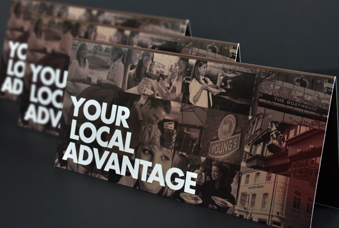
YOUR LOCAL ADVANTAGE
A scheme aimed at local businesses in the SW15 area, provides the card holder with discounts and offers in the local Young's pubs.
As a business to business mailer, I felt that the communication needed to be direct and straight talking in its approach. This DL folder that contains the plastic loyalty card, has a spot laminate on the title of the cover, and is printed onto a thick premium board, making the item feel like an invitation or gift card.


LOGO DESIGN
This selection of logo designs created for some of the pubs inside the estate, shows a diversity of designs and tone.
Each identity is treated as an individual brief, outside of the Young's group, because each pub has a unique offering, in a particular location, with specific objectives. Target audiences can vary hugely, as can the personality and ambience of the pubs. So, it's important to tap into the pulse of the pub, and let it inform the creative decisions.